Case study 05 / 05
Turning a portfolio deck into a website, with AI as the build team
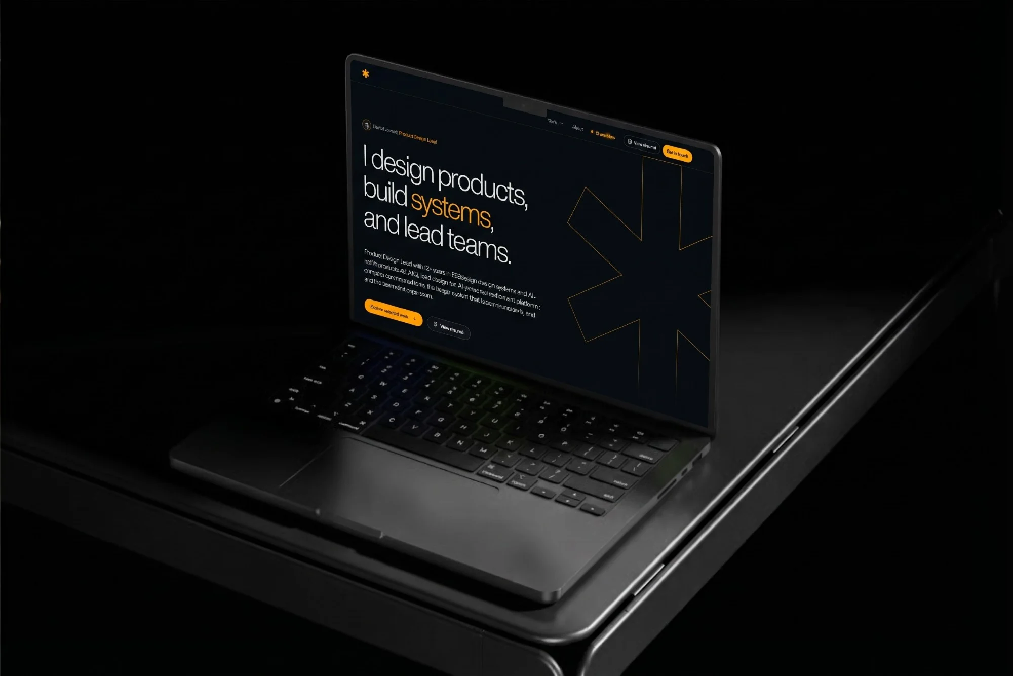
My portfolio used to be a 71,536px Figma deck you sent as a PDF. I turned it into this website in ten days, directing Claude Code through 200+ rounds of written feedback: every layout, word and animation reviewed, argued with and often redone.
- Role
- Designer, art director and product owner
- Year
- 2026
- Platform
- Personal: portfolio website, designed in conversation and built with Claude Code
- Status
- Deployed on Vercel and still in active iteration before launch
- Reading
- About 7 min
At a glance
- The problem
- A deck is read once, in order, by someone you sent it to. A website is skimmed, on a phone, by a recruiter with a minute. The same work needed a different shape, and a much higher bar for the details.
- My part
- Art direction, positioning, information architecture, copy, and every review and decision. Claude Code wrote the code, ran the checks and proposed options; I decided what stayed, what changed and what was thrown away.
- Design decision
- Treat the AI like a fast junior team, not an oracle. Every output was reviewed in the browser, corrected when the facts were wrong, and judged by eye, on desktop and on a phone.
- Outcome
- A deployed portfolio with five case studies, a password gate that can’t be bypassed from the browser, and a working rhythm I now use on client work: decide by eye, check every fact, keep everything reversible.
Contents7 chapters
The starting point: a deck, sent one person at a time
Before this site, my portfolio was a single Figma frame: 1920 by 71,536 pixels, built to be exported as a PDF and sent to one person at a time. It opened on a confidentiality notice, listed thirteen tools with a paragraph each, and walked through two case studies, the lighting app in about 14 slides and Wali in about 33.
It was never finished, and it didn’t pretend to be. Its index promised three case studies and held two, plus a slot still reading “Case study title goes here”. A Projects section was listed and empty. The social slide named four networks without a single link.
Portfolio 2026: the Figma deck, exported as a PDF
Cover and close
Read first and last
- Confidentiality notice
- Five-item index
- Four social networks, no links
About
- Portrait
- Four stats
- Short bio and AIO
Tools, expertise, process
The longest part
- 13 tools, a paragraph each
- Eight areas of expertise
- Six-step design process
Case studies
Three promised
- Lighting app, about 14 slides
- Wali, about 33 slides
- “Case study title goes here”
Projects
Listed, empty
- No content yet
Keep the identity
The near-black ink (#030a0c), the amber accent, Helvetica Now Display and the six-armed asterisk all came from the deck, and all made it to the site.
Lose the document framing
A confidentiality notice makes sense on a PDF you send. On a public site it reads as a closed door, so it went, and the password moved to where it belonged: the case studies.
Lead with decisions, not tools
The longest section in the deck was a list of software. For the roles I want, what I decide matters more than what I open, so tools folded into one strength and an AI workflow page of their own.
A website is read differently
A deck is read once, in order. A website is skimmed on a phone, by a recruiter with a minute.
So the first decision wasn’t visual. I wrote down who the site is for: Heads of Design, founders and recruiters hiring a Product Design Lead or a Principal designer at B2B SaaS and AI product companies. Everything else followed from what that reader needs to see first.
The page order became an argument: selected work straight after the hero, then design leadership, experience, about and contact. AIO, the work I lead today, moved to the front.
Designing in conversation
I designed by looking at the page, writing down what was wrong, and deciding what stayed.
Every change started as a message. Some were one line (“The g is cut off in the hero section”). Most were numbered lists of five to ten fixes, often with a screenshot I had drawn on. Claude Code made the change, checked it in a browser pane, and showed me the result. I looked, and either moved on or wrote the next list.
Over ten days that came to 202 written rounds of feedback across 14 working sessions and 37 commits, each pushed to Vercel when I said so, never before.
- days, 7 to 16 Nov 2026
- 10
- written rounds of feedback
- 202
- working sessions
- 14
- commits, each deployed on request
- 37
Counted from the session transcripts and the git history.
Mine
- Positioning: who the site is for and what it must prove
- Art direction, and every visual call
- All copy, approved line by line
- Which ideas to build, and which to throw away
- When to deploy, and when something was done
Together
- Information architecture and navigation
- Heuristic reviews of the whole site
- Options to choose between, built live
- Fact-checking against the résumé and the Figma files
Claude’s
- Writing and refactoring the code
- Responsive layouts, motion and accessibility checks
- Browser verification after every change
- Deployments, analytics and the contact email setup
Built with
Design came straight from the source: Claude read my Figma files through Figma MCP, so colours, type and real screens were taken from the files rather than retyped.
The build is a real codebase, not a template: Next.js, React and TypeScript, styled with hand-written CSS and design tokens, no UI kit. Lenis gives the scroll its weight, Hugeicons the icons, and my licensed Helvetica Now Display the type.
Every push to GitHub deploys on Vercel, so a change could be live minutes after I approved it. Vercel Analytics and Speed Insights show how it’s used and how fast it is, and Resend delivers the contact form.
The case studies are unlocked by a password checked on the server, and the like counts are kept in Upstash Redis, so both stay correct whoever is looking.
Design
Build
Ship and measure
Protect and count
Ten days, seven passes
Bring the deck’s identity across (7 to 8 Nov)
Real images from the Figma file, my licensed Helvetica Now Display, my signature under the portrait, client logos, fewer font sizes, links to past employers. A light mode went in and came out the same night; its code stays behind a switch.
Reposition for the room (8 Nov)
I wrote a brief for the roles I’m targeting, Product Design Lead and Principal IC, and the page was reordered around it: hero, selected work, design leadership, experience, about, contact.
Give it a body (8 to 9 Nov)
Separate About and Contact pages, a working contact form, a better share image for links sent on WhatsApp and elsewhere, analytics and speed insights, and a design-token pass after I asked how many font sizes the site was really using.
Correct the facts (9 Nov)
The leadership section described a unified design system across AIO. There isn’t one: B2B and B2B2C surfaces have different design languages on purpose. It was rewritten, with the platform’s real areas: Order & Pay, Marketing, Inventory, Staff, Office and Analytics.
Design for the phone first (11 to 12 Nov)
“Treat it like the medium with the most users.” A full mobile pass, a 30% lighter scroll, one password popup for every case study, a heuristic review of the whole site, and an SEO check of the new copy.
Tell the full stories (12 to 15 Nov)
A case study template built from a written brief, then Edge and the lighting app inside it: real screens in scrollable windows, a lo-fi to hi-fi slider, design tokens in a Figma-style panel, and diagrams and prototypes written in code.
Sweat the details (13 to 16 Nov)
A navigation where every item opens a page, a Work menu with a preview that follows the cursor, testimonials, an interactive skills asterisk, and dozens of one-line fixes to spacing, blur and motion.
What I chose, and what it cost
ChoseBuild three options live and pick in the browser
OverChoosing an idea from a description
WhyFor the About page I couldn’t choose between a skills asterisk, a career timeline and a “where my week goes” dial on paper. All three were built, I looked at them in place, kept the asterisk and cut the other two.
The costTwo designs built to be deleted. At this speed, that was cheaper than a wrong guess.
ChoseLock the case studies on the server
OverA password check in the browser
WhyCase studies hold client work. A check in the page can be read with Inspect element; a server that only sends the story after a valid password can’t.
The costCase study pages are rendered on every visit instead of served from a cache.
ChoseSwitches, not deletions
OverRemoving features I wasn’t sure about
WhyLight mode, the password lock, the under-construction page and the Projects and UI explorations sections are each one setting away. I change my mind often, and every reversal should take a minute.
The costMore code than the live site strictly uses, all of it kept working.
ChoseReal screens, captured or rebuilt in code
OverExported slides with a background
WhyThe lighting app’s architecture and flows were redrawn in code, and Edge’s pages scroll inside real windows, so the work reads as a product, not a picture of one.
The costFar more build time per case study than exporting slides would have taken.
The end point: a site that does a deck’s job, and more
The deck’s sections didn’t disappear; they found the right home. The case studies became full stories. The tools became an AI workflow page. Expertise and process became the About page. The empty Projects slide became a section that opens when there is something to put in it.
danialjaveed.vercel.app
Home
- Hero and selected work
- Design leadership
- Experience
- Testimonials
- Contact
Work
Password protected
- Five case studies
- Projects (coming soon)
- UI explorations (coming soon)
About
- Skills asterisk
- Leadership
- Experience
AI workflow
- Principles
- Tool stack
- Where judgment stays human
Résumé and contact
- Résumé page and PDF
- Contact form
Today

Home
Today

About
Today

AI workflow
Today

Home on a phone
Surfaces
- Ink#030A0C
- Ink 2#071215
- Ink 3#0C1B1F
- Teal echo#0D3A43
Text
- Bone#E2E2E2
- Mist#C4C7C8
- Fog#8F8F8F
Accent
- Amber#FFA202
- Amber hover#FFB73D
- Teal#6DC8C7
What working this way taught me
AI made the building cheap. That made the deciding the whole job.
Speed moves the bottleneck to taste
When any change takes minutes, the limit is how clearly you can say what’s wrong: which element, by how much, compared with what.
Facts need an owner
The model wrote fluent, plausible copy about my own work that was sometimes wrong. Every number and claim on this site was checked against my résumé or the original Figma files.
Second opinions are cheap, so take them
I ran critiques from ChatGPT past Claude and kept the best of both. The point was never which model was right, but what held up when I looked.
Done is a decision
A countdown page went up while the site was still moving, to make the launch real. The details will keep coming; I expect to be obsessing over them for years.